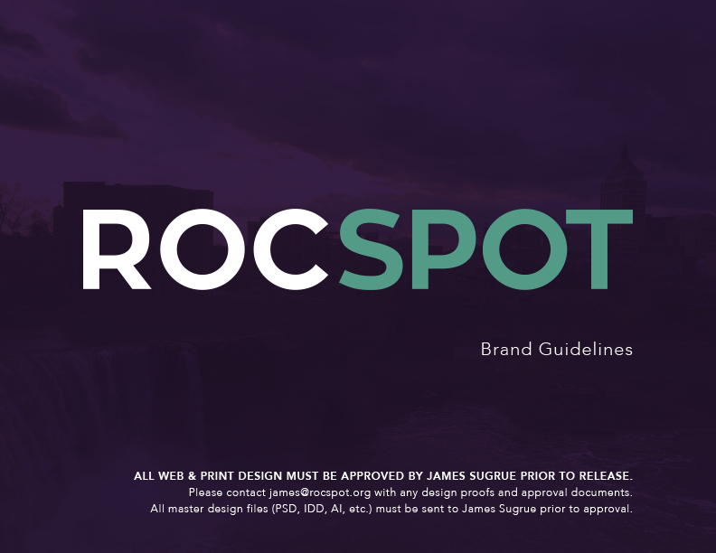
ROCSPOT Brand Guidelines

Key Elements of the Brand Transformation:

Refined Visual Identity:

  • Logos: Designed with clear guidelines for consistent and legible usage across all platforms.
  • Colors: Shifted to a modern palette of deep blues, vibrant oranges, and muted grays, moving away from the cliché green and yellow.
  • Typography: Implemented Avenir and Source Sans Pro for a clean, contemporary look, ensuring cohesive and polished communications.

Consistent Communication Style:

  • Target Audience: Focused on younger homeowners, business owners, and tech-savvy individuals.
  • Voice and Tone: Educational yet cool, blending scientific jargon with pop culture references. This made complex solar energy concepts accessible and enjoyable, positioning ROCSPOT as knowledgeable and approachable.

Strategic Social Media Presence:

  • Engagement: Consistent posting during peak social media times with shareable, informative content.
  • Persona: Portrayed as the “cool teacher” of solar energy—friendly, warm, and professional. The tone was humble, scientific, and honest.

Approval Processes:

  • Design Oversight: All designs required approval to ensure strict adherence to the brand guidelines, maintaining a consistent visual identity.

By adhering to these guidelines, ROCSPOT transitioned from a generic renewable energy company to a distinguished brand in the solar industry, known for its professional and engaging identity.

Description

  • ROCSPOT

One of my primary goals as Director of Communication at ROCSPOT was to transform the brand to stand out in the renewable energy industry. Their original designs were very literal and cliché: a yellow sun, green type. Exactly the type of thing you'd expect from a solar energy company—or a petroleum company trying to distract from spilling four million barrels into the Gulf of Mexico.